I found this area of Camden really interesting, it had a lot of different culture and stalls. Then when I saw this shop it looked very old and run down compared to the rest of Camden that is always busy and bright. I really like the composition of this image- the big red double doors and the small sign then part of the building and window. I wanted to keep this photo looking natural, so I slightly edited the curves to enhance the colour but kept everything else the same.
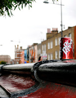
I took this image at the end of the day, and the lighting wasn't as good as some of the others. I wanted to get the perspective of the bringe with the can to make it more interesting. The shops/houses on the other side of the street add to the image and make it more dynamic. I like that the backgrouond in slightly out of foucus so your eyes are drawn to the bridge and the can which are a simular colour. I wanted this image to have an impact and be bright to catch peoples eyes. I edited the curves a lot to bring out the vibrant red of the can without making it look unnatural. There were also a lot of highlights that I wanted to bring out in the bridge and the can, the highlights on the bridge helped lead your eye down the image which I really liked.
I found that this image reflected Camden, the young couple on a bridge with grafftti behind them. I again like the composition and perspective. The couple aren't dead centre they are slightly off to the left which makes the whole image more interesting. Then the bridge leads you up to them and helps to draw you in. This image was very dark to begin with and was hard to make brighter without making it look fake, so I used curves and levels to try and brighten it up. Then the match tool to incrase the lumince.
I really like how this image is laid out and the different angles and shapes it creates. This image really captues Camden with all the bright colours and people. I didn't want to put this image in black and white as it would loose all it's impact and wouldn't reflect Camden as well as a whole. This was my favorite image of all that I took as it was naturally really bright, and although it may look fake I didn't have to edit it at all, only cropping it down so it was more compact and interesting. I don't think the image would be as good it I had of cropped out the sign in the forground as it gives more shape and makes it different, it also brings out the perspective more.


No comments:
Post a Comment