Saturday, 22 January 2011

Brad Evans Inspired Urban Photography

I really liked Brad Evans style of photography and his candid and intereseting shots, which no two are simular. I liked how he would turn something normal into something different. I like how he uses different angles and camera shots to make his work more exciting and different. He mainly works in balck and white which make all his images look very bold and sharp, although when he does use colour he only uses a little bit that makes a big difference, using a bright vibrant colour such as red. I also really like his settings as the are always busy and imtereseting with different types of people.

This was one of my final images that I took in cambridge where I was taking my urban shots, I really like this image as it looks quite old and different, especially with the eldery man dressed in quite smart but casual clothes. I wanted to put it in black and white to reflect Brad Evans work and his style but not compleatly copying him. I really like that it's an action type shot and it's candid, I think it makes it more person and natural and also more interesting to look at, it gives the image more depth and reason. I didn't want to overly edit this picture, so i simpily out it into black and white and adjusted the curves so it would bring out the draker and lighter tones in the image. I also cropped the image down so it would be more compact and your eyes wouldn't be distracted by whats going on behind him.


This was my final image of my urban photography, I really life the perspective it created and draws you in. The bikes lead you in to the image and make it interesting and precise. It also works well as the woman is centre of the image and is looking straight at the camera which makes more of an impact. I put the image in black and white as I think it makes it bolder and the jumble of bikes look less busy than they did in colour. I think this image was really inspired by Brad Evans and his style come through in the composition and editing. I wanted to keep it all natural so I didn't want to overly edit it, so I only turned it into black and white and slightly edited the curves and levels to bring out the various tones.

Thursday, 20 January 2011

Dark Room

Photogram
We firstly produced a photogram, when you place objects on top of some photo paper and expose it 20-30 seconds. Then develop it using the developer(for 1 minute), stop then the fixer and leave it in the water, then finally hang it to dry.
I think it creates a really interesting effect, although I exposed mine for too long and it would have looked better if you could make out some more of the objects. But i especially like the film strip as you can clearly see what it is and the pictures in it.

Pin-Hole Photography
We used tins with a small hole in it as the lens that we covered up, then with photo paper in the tin which created our 'camera'. We then uncovered the hole when we found what we wanted to take a picture of then covered it back up after about 10-15 seconds. We then proceeded to develop our images that came out as negatives, we used the same process of developer for 1 minute then the stop and fixer before hanging it up to dry.
When it had dried we turned the image to a positive by placing the negative image face down over photo paper then exposing it for 20-30 seconds using a contact printer. Then developed the positive image.
I quite liked how my image turned out, even though it was very dark and slightly out of focus due to the tin shaking. I think it has an eerie feel to it with the bright white in the centre behind the tree. This form of photography is very risky as you don't know how your image will turn out which I quite like but the process is quite time consuming if your image doesn't turn out right.

Film Photography


When we started our film photography, after we had developed our film roles and created a contact sheet we choose the images we wanted to enlarge and develop. We used test strips to see how long we should expose our photos for the best results, uncovering parts of the image every 5 seconds to see what amount of time is best for the particular photo. We then went on to doing a test image to see if the time frame worked with the whole image. So we could finally expose our image for the right amount of time for the best out come, to be able to get black, white and all the grey mid-tones.
This was my final image exposed for the specific amount of time I worked out. I think it works well as the sunlight comes through and contrasts with the dark shadows to create an interesting image. I like that the model isn't completely aware/ready for the photo as it makes it have a candid element.
Again this way of taking photos can be risky as you never know what they are going to turn out like until you develop them ad you don't know if they will be over exposed or too dark.
Final Film Image
This is my final film photography image, I found the composition really interesting with the light coming through the trees making them into silhouette. The sun is also central so it makes the whole image look balanced. The different shaped and sizes of the trees make it more interesting rather than it being one tree. I like that the photo was taken in black and white so you get the natural tones which you wouldn't get if it was taken in colour.

Rankin Studio Inspired Portraits


I took inspiration for my studio portraits from Rankin, I really liked his style mainly using a simple background and clothes and minimal props for his portrait work. I really liked the lighting he uses, creating shadows on the face making it look more interesting. His images also say something about the model in them. I wanted to achieve something similar by keeping my image simple and effective.
This was my final image of my Rankin project, I was really pleased with the lighting, although it was quite natural it still created some strong shadows that lifted the image up. The plain white/grey background also helps with this and makes the dark clothes the model and his dark hair look bolder and make a bigger impact. I like the composition, how he is leaning to the left with his head tilted in the same direction too. The photo wasn't carefully planned so you get the movement and the candid quality in it with a genuine facial expression, I think this makes the whole thing more natural and interesting. I didn't want to edit my image too much I cropped down the image so it was more compact and didn't take your attention away from his 'gesture'. I was pleased with the lighting, so I slightly touched the image and edited the curves to bring out some of the colours. I also wanted the image to be quite dark and contrasting with the background so i tries to make the models hair and jumper as dark as I could without making it look edited. I also didn't want to loose the shine in the hair that the lighting had created. I also wanted to avoid making his white shirt too bright and loosing the texture and the creases in it that made it look natural.
My image is different from Rankin's as most of his images are only of the face and a bit of their shoulders. But mine was a mid-shot which I felt worked well with my image. I also kept my image in bright colour rather than in dark lighting/colour or black and white.

Camden Lock

This was my only black and white image that I choose, as all the shapes and angles looked a lot stronger and bold in black and white but they got a bit lost when they were in colour. I really like how the building curves around and the windows and pointing up make the photo look more interesting. I also think the man standing on the balcony make it look more personal and adds another element to the image. I think the blank sky on the left make the building look more important and bold compared to the grey/white sky. I hardly edited this image at all other than turning it into black and white and then slightly editing the curves to bring out some of the various tones and shades in the image that lift the whole image off the page.


I found this area of Camden really interesting, it had a lot of different culture and stalls. Then when I saw this shop it looked very old and run down compared to the rest of Camden that is always busy and bright. I really like the composition of this image- the big red double doors and the small sign then part of the building and window. I wanted to keep this photo looking natural, so I slightly edited the curves to enhance the colour but kept everything else the same.

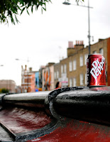
I took this image at the end of the day, and the lighting wasn't as good as some of the others. I wanted to get the perspective of the bringe with the can to make it more interesting. The shops/houses on the other side of the street add to the image and make it more dynamic. I like that the backgrouond in slightly out of foucus so your eyes are drawn to the bridge and the can which are a simular colour. I wanted this image to have an impact and be bright to catch peoples eyes. I edited the curves a lot to bring out the vibrant red of the can without making it look unnatural. There were also a lot of highlights that I wanted to bring out in the bridge and the can, the highlights on the bridge helped lead your eye down the image which I really liked.


I found that this image reflected Camden, the young couple on a bridge with grafftti behind them. I again like the composition and perspective. The couple aren't dead centre they are slightly off to the left which makes the whole image more interesting. Then the bridge leads you up to them and helps to draw you in. This image was very dark to begin with and was hard to make brighter without making it look fake, so I used curves and levels to try and brighten it up. Then the match tool to incrase the lumince.

I really like how this image is laid out and the different angles and shapes it creates. This image really captues Camden with all the bright colours and people. I didn't want to put this image in black and white as it would loose all it's impact and wouldn't reflect Camden as well as a whole. This was my favorite image of all that I took as it was naturally really bright, and although it may look fake I didn't have to edit it at all, only cropping it down so it was more compact and interesting. I don't think the image would be as good it I had of cropped out the sign in the forground as it gives more shape and makes it different, it also brings out the perspective more.

Wednesday, 19 January 2011

David Bailey Recreation

I wanted to recreate some of David Bailey's work for my project. I wanted to choose a quite iconic image, and I think this photo of Jack Nicholson is very recognisable and interesting. There was also a lot I could do with it, as it has lots of contrasting light that make interesting shapes. I wanted to try and achieve the shadows and highlights. But I also liked the fact that it wasn't a serious photo, his facial expression was funny and made the picture look strange and serious at the same time, this was another thing that I wanted to do in recreating this image. I also wanted to keep the plain background although I planned to use black so to make it varied, because I wanted to make my own image and not just completely copy this one, David Bailey's image was just my primary inspiration and I would expand with my own image.

This was the image that was closest to the original that I took, I didn't use it for this reason. I wanted to create something original and that would stand out against David Bailey's image rather than just being a vague copy of it. I also decided not to put the majority of my in black and white as I really liked the colours that were created in this photo shoot. But I found that most of the light was too bright on the left side of the face, so I was able to decrease the light in photo shop using curves. I didn't edit this one as I knew I would not want to use it so the lighting is very harsh on this one and makes the whole thing look a bit strange.

I choose this as my final image as it was fun and interesting like the original. It was also quite similar but not too similar that it would look the same as David Bailey's. I like the shadows i created with the lighting and it gives the skin a smooth look, then the scrunched up eyes make a contrast around the eyes. It also gives a modern twist on the image, as my model is female and is wearing quite an interesting patterned top which makes it feel more young. Also the fact that the image is in colour makes it more modern, I did originally put all my images in black and white so they would create the same effect as the original but I found that i didn't like them as much as I did in colour. I used curves and levels to edit my end image, as i wanted to decrease the very harsh lighting on the left side of the face that appeared in all my photos.